


For a couple of months at least for now, the Sparks Direct site was completely overhauled - in effect, we have a brand new website, totally different from the one we had last year!
Underneath the new design and features, it's still the same amazing electrical wholesaler you've known for the past quarter-century with the same excellent customer service and knowledge base you've come to expect from us.
But still: we come to you with a slick new website! We'd like to thank our digital agency, Cyber-Duck, for putting it together.
Let's take a look at some of the new features.
A Complete Design Overhaul
The main thing is the new design, which is much cleaner now, and more easily navigated.Simply hover over the black menu bar at the top to view sub-categories - all our products are grouped by clear colour-coding. And when you're inside, just click the images to browse our extensive selection!

So if you need a kitchen light, simply choose "kitchen." If you need a light fitting for bedroom, select the appropriate icon.
The company page is much more informative and a little more fun: did you know we've tweeted over 7,000 times?
It's also much easier to contact us through that page now, by email or phone. All this - the entire website with the pages and the products and the information - is responsive and more touch-friendly.
More Images for All Our Products
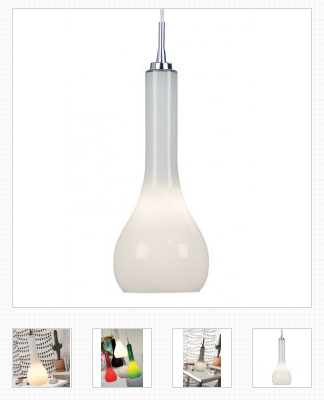
The item pages themselves are also continually being reviewed to include more informative content - more quality information and description!
If you wish to compare two or more products, simply click the "compare" button just underneath the "add to basket" option - the site will direct you to the comparison page, or you can keep browsing and adding more products to it.
This helps find exactly what you need for the best value.
Touch-Friendly - Fully Mobile Responsive!
But, of course, the best feature of the new site is that it is now much more mobile-friendly.The larger buttons mean that selections are easier, and now that we're a touch-responsive site, it means you can browse www.sparksdirect.co.uk on-site on your mobile phone, smartphone, iPhone, Android phone, or any kind of tablet, and order exactly what you need, without having to go to a computer!
We love our new website, but we're still in the middle of tweaking this new design, and we especially love the interaction with the visitors and customers!
What do you guys think of the design and mobile-friendliness of our site?